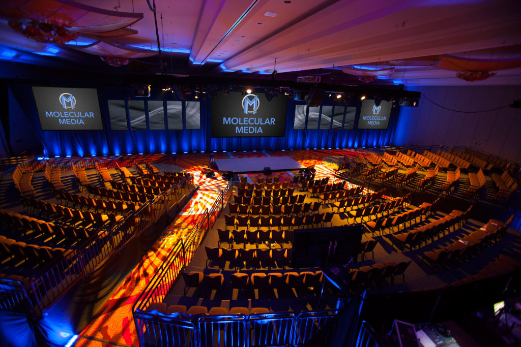
Today Molecular Media launches a full rebrand covering all current marketing materials. The change comes after more than a year of work from Molecular Media CTO, Tom Ierna. Mr. Ierna was tasked with the rebrand after Sales Director Rob Salo suggested the logo be updated to a more recent look and feel. Said Mr. Salo “Molecular Media prides itself on being on the cutting edge of event and production technology, and we wanted a brand image that reflected that pride and commitment.”
Mr. Ierna agreed that it was time for a change and had this to say about the decision:
“Molecular Media turns 18 years old this year, so what better way to celebrate corporate adulthood than a re-branding? Our logo was last re-designed over a decade ago, and while it was instantly recognizable, it was stale because it was built on trends from the era in which it was created. We wanted a strong corporate identity which points out our anything-goes customer service attitude, while feeling timeless.”
Refreshing the logo was only the first of many steps, and the Molecular Media team decided again to partner with local designer Andi Graham and her firm, Big Sea Creative. Working for months and through dozens of iterations, the logo was finalized at the end of April 2015. Graham said of the process:
“We had fun with this one. We’d already taken a bold step when designing the new website to move away from the existing and dated color palette; now we needed to design a modern logo treatment to match. The new logo is a play on the M’s in Molecular and Media, obviously, but we went for an art deco geometric treatment that we think is both strong in visual representation but also reminiscent of the production extravagance that was the age of Gatsby. The logo will work in almost any treatment – horizontally or vertically – and alone as as a symbol, something the previous logo was lacking.”
Armed with a new logo on which to build their new identity, Ierna and the rest of the Molecular Media team started to build the new image with branded merchandise. From new technician polos to business cards and case stickers, a complete refresh of was required. Relying on an old partner, Molecular Media turned to Scooter Cardoza and Trinity Graphics.
“…one of the most exciting processes at Trinity Graphics is working with clients who are going through the rebranding process. We love the challenge of bringing their logos to life through screen-printing and embroidery. The screen-printed t-shirts and embroidered shirts turned out perfect! Working with the Molecular Media team on this project was inspiring, and we were happy to have played a part in their rebranding process!”
CEO Andrew White was ecstatic about the final product, saying:
“Our new look has a bit of a superhero vibe to it. It’s fun and fresh, built on 18 years of making the impossible possible for our clients.”
With the final elements in place, the company is hopeful that the new look can and will reflect the excitement and commitment they feel heading into the future.